
The colours are repetitive, when it comes to the text all of it is in silver, keeping the site related. There is plenty of space in the background and all the pages are focused on one specific thing eg. Characters, Storyling etc.
The overall feel is a bit omnious, like something very big and important and final is comming up, which is true because it is the long awaited end of a long series. All the colours and the burning background add to the tragic atomosphere.
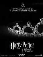
There is a varitey of posters for the film, some contain images of characters and some of objects which are important in the film, for example the Diadem of Ravenclaw.
The website is layed out very clearly, the background stays the same for every page and the information is all displayed in the same fashion, the box just reappears with a different content.
It definately appeals well to the the target audience, both people who are already fans of the series and to people who know nothing about it. It is colourful, and the fact the background is a huge burning castle begs the question "what is going on?"
I like the layout, is looks really clean-cut and proffessional.
http://harrypotter.warnerbros.com/harrypotterandthedeathlyhallows/index.html
No comments:
Post a Comment